We’re sat down with Yon Raz- Fridman, the CEO and founder of Supersocial. Yon is a visionary in the world of metaverse experiences and brand integration on platforms like Roblox. Supersocial has been at the forefront of creating iconic experiences and brand worlds in the metaverse, partnering with major names like Bandai Namco, Rolling Stones, and Heidi Klum.
We talked about:
The exciting realm of the metaverse, particularly focusing on Roblox, where Supersocial does a lot of their work.
How this virtual space is shaping the future of entertainment, commerce, and social interaction.
The potential of the 3D internet, how brands might engage with it if they’re not already, and how it can be a great tool to learn how younger people are shopping and behaving in these worlds today.
To learn more about Yon and Supersocial, visit https://www.supersocialinc.com Check out the Into The Metaverse podcast at https://www.intometamedia.com
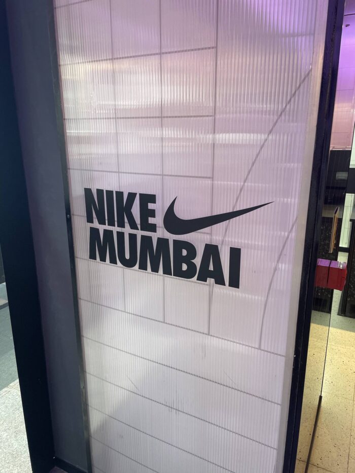
Nike in Mumbai.
Upon our return from a few weeks in Mumbai, my family and I embarked on a quest that perfectly encapsulates the interests of my two boys, aged 13 and 10. Their fascination with all things typical of their age—video games, popular YouTubers, and the allure of Nike—led us to a mission: hunting for Nike stores and also intriguing knockoffs in places like Fashion Street, nestled within the bustling cityscape.
Meanwhile, my personal quest was more straightforward: I sought a Nike Mumbai shirt. Having collected Nike shirts from various cities worldwide—Shanghai, London—finding a Mumbai edition was a priority. However, our initial store visit turned up empty-handed. It was a helpful store associate who steered us toward the Nike outlet at Palladium Mall, sensing both my desire and the boys’ potential delight in the search.
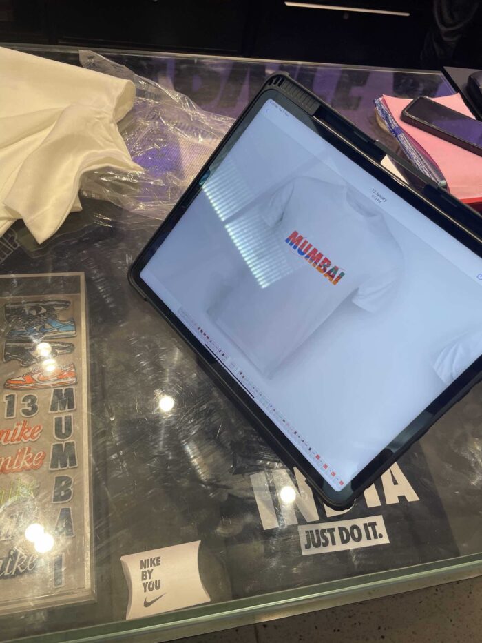
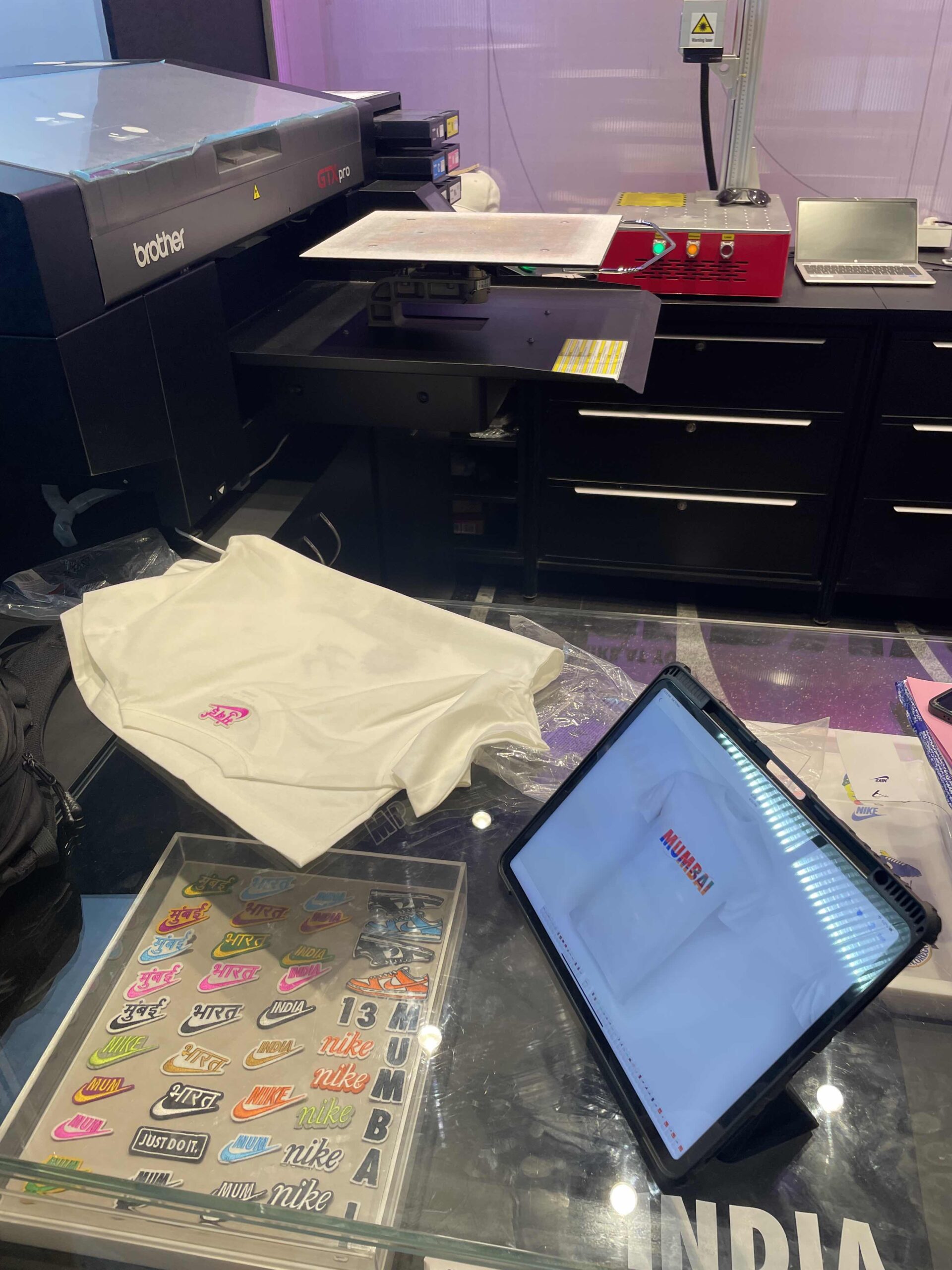
The Palladium store proved to be an unexpected treasure trove. While the customary Nike station for personalized tees and hats was there, what truly astonished us was the collaboration with local artists. These creative minds ingeniously wove iconic city landmarks and cultural motifs into Nike designs, paying homage to the essence of Mumbai and India. Adding another layer of magic, the fusion of artists and Nike extended to an Instagram AR filter, animating these unique designs on our phones.
In my globetrotting adventures, I’ve encountered an array of anticipated designs. Even within high-end retailers, the beauty of unexpected designs has become somewhat predictable. Yet, what Nike accomplished in partnership with local designers left a lasting impression on me.
As a family, adorned in our newfound Nike shirts, we’re not just wearing fabric—we’re sporting cherished memories. This experience has deepened our appreciation for Nike, intertwining our passion for the brand with the rich tapestry of Mumbai’s culture.
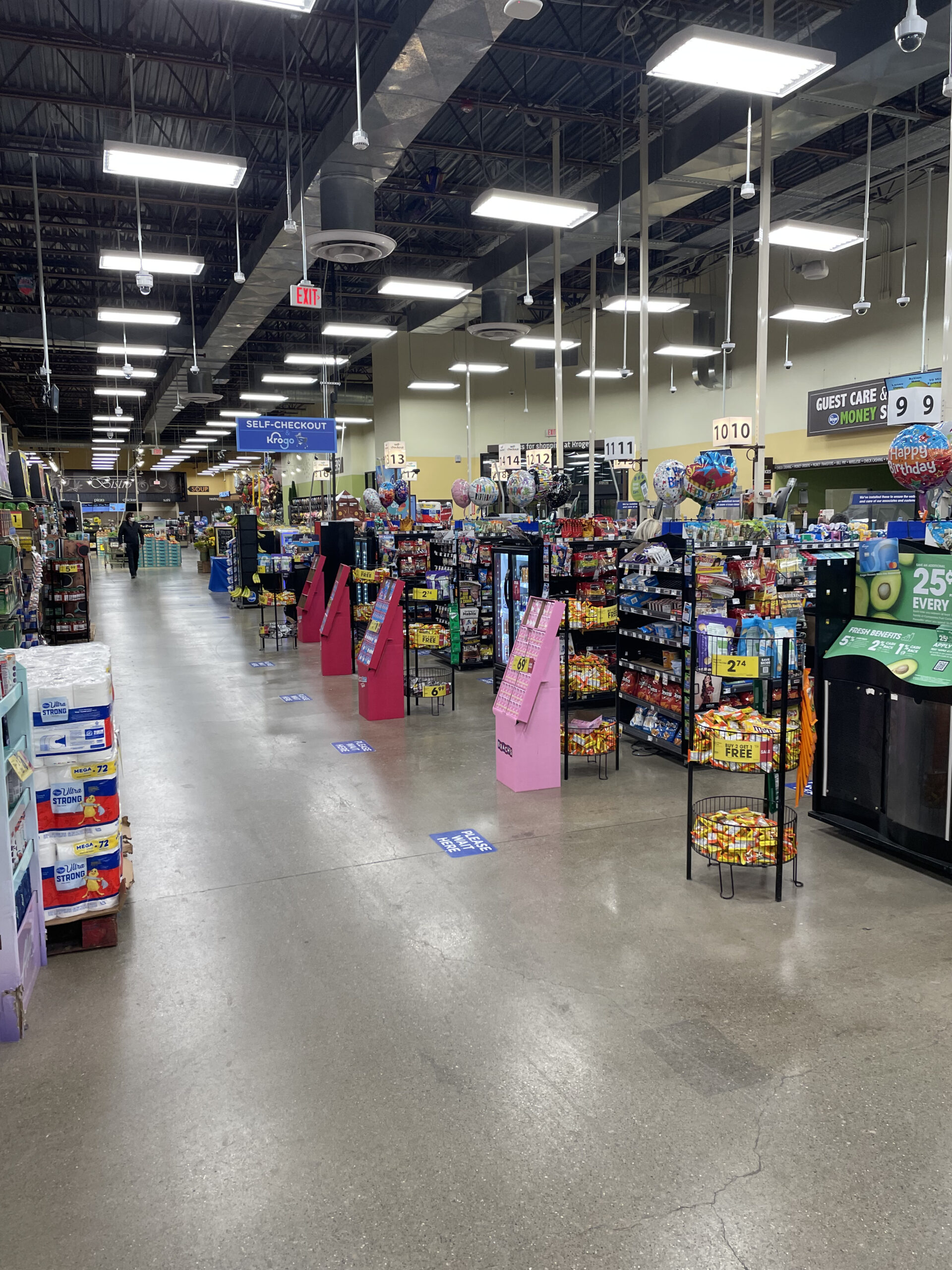
Friday afternoon my wife and I went to Kroger to pick up some groceries. As usual, our small list became a full cart. Kroger is one of the four grocers we shop at but it’s not our regular grocery store. As we walked in, my wife saw a Krogo cart and suggested we try one.
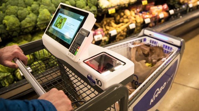
In case you aren’t familiar with it, KroGo uses a smart cart from Caper. On the top of the carts are a small tablet sized display and scanner. A shopper picks up an item off the shelf, scans the item barcode, the scanner reads the barcode and adds the item price to the order which is tracked on the tablet display. The display which shows a running tab of items and price on the display. If you have used an Amazon or other smart cart, they are all about the same.
KroGo Cart Powered by Caper
Make it Ridiculously Easy
We started in fruits and veggies and it worked just fine. We then put a four-pack of Cut Water (Tequila Paloma, my wife’s favorite) through the process, but the scanner wouldn’t read it (likely an age restriction thing).
When I realized some eggs were on sale, I punched my loyalty number in on the cart display but I needed to have clipped the digital coupon to get the sale price. I didn’t have time for that, and didn’t know my loyalty password, so I moved on.
How do we check out?
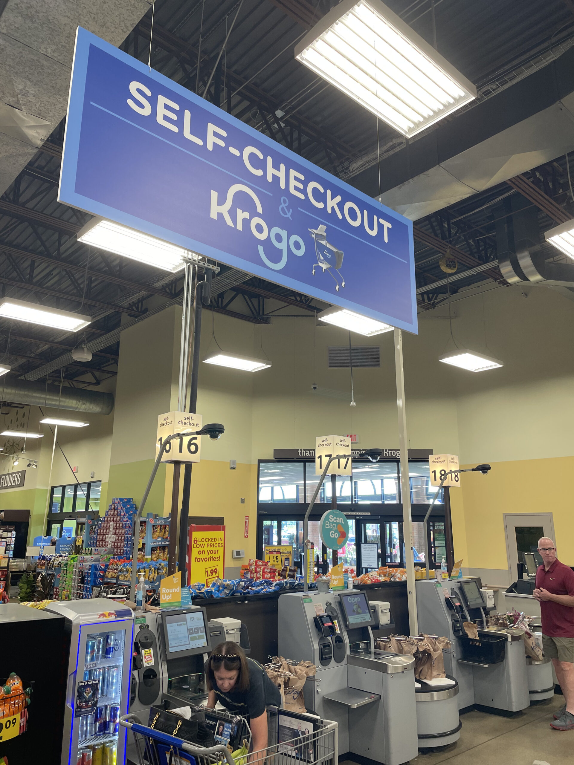
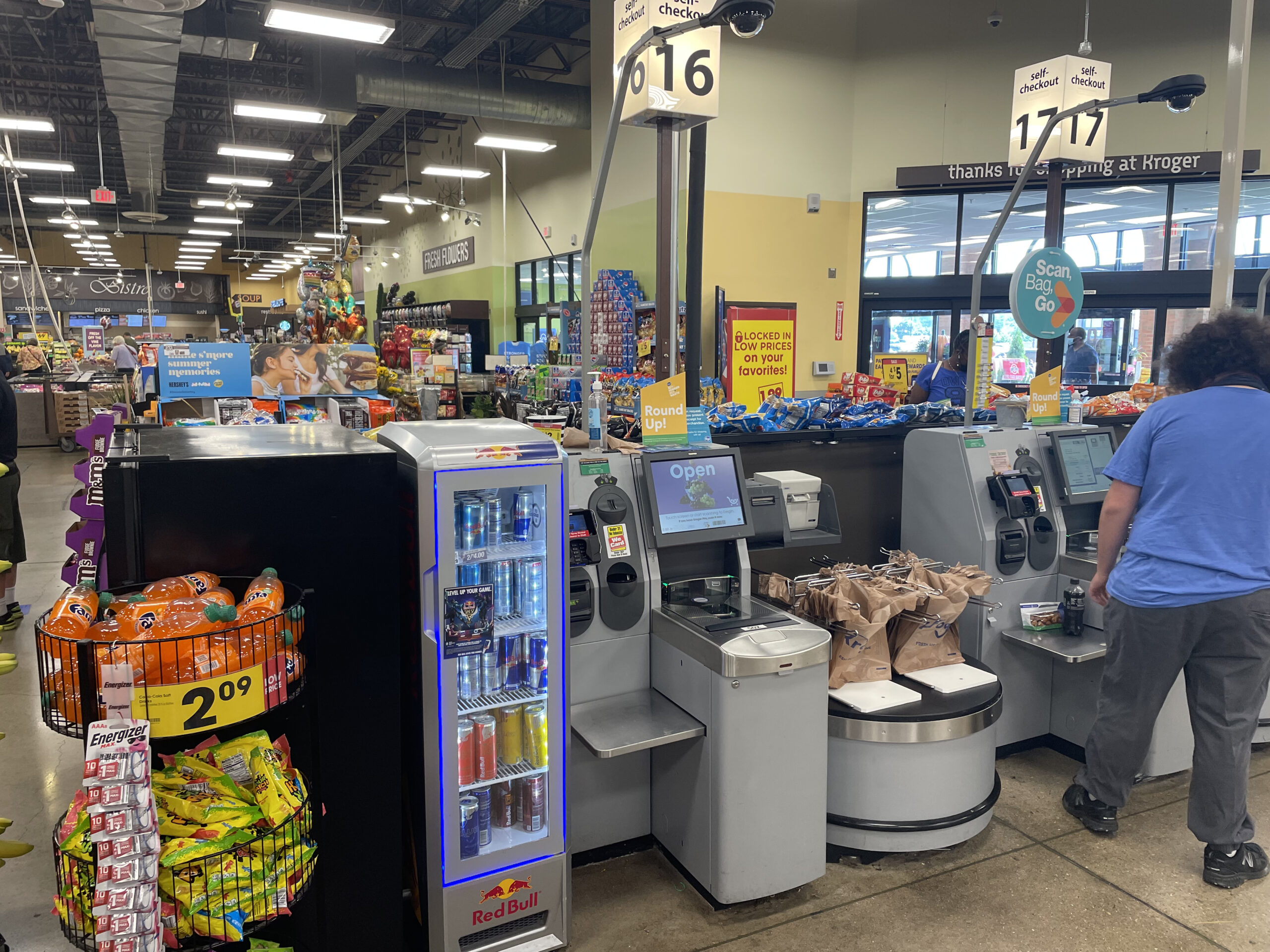
There was a sign over both self-checkout aisles that read Self-Checkout & Krogo. The area was pretty busy (Friday afternoon) and we couldn’t tell where to go or what to do once we were under the sign.
We saw a sign
There was no other indication for Krogo and no associate to help us. The Kroger associate stationed there was helping another shopper with her order at a self-check machine at that moment.
We stood there, I am sure looking a little confused, for a solid 3 minutes. All, while letting other shoppers behind us go through the self-checkout process. We walked to the other side of the self-checkout but it was a product display, not a Krogo checkout area.
When the associate finally finished helping the other shopper, we asked for help. We told her we needed to pay but that our Cut Water wouldn’t scan and that we needed help getting the coupon for the eggs on sale. She had me scan the Cut Water and eggs at the self-checkout scanner. Once that transaction was complete, we paid for the other groceries using the Caper system on the cart.
As we were walking away, my wife said that was a “waste of time”, we should have just used a regular cart.
Frustrations Minor and Major
The experience left a bad impression on me and, more importantly, my wife. My biggest frustration wasn’t the Cut Water issue, that happens. It was the lack of focus on overall customer experience.
Minor. I needed to pull my phone out to figure out the digital coupon issue. There is a display on my cart, I am logged in, I hadn’t seen the coupon until I was standing in front of the eggs. The friction was completely unnecessary. Make it easy for me to get the lowest price, period. That’s an issue beyond Krogo. Maybe I’ll cover that in another post.
Major. Someone at Kroger thinks a single giant Self-checkout Krogo sign over self-checkout is enough for people. It’s not. If I stood there, looking around for some indication of what to do, there is no doubt, others have the same problem.
What do I do?
Did Kroger observe any shoppers going through this experience? Does anyone at headquarters even know any of the frustration points during this process? Will they consider this test a success? A failure? Will they know why? What were their goals? What are their success metrics?
Since I have worked on many front end design projects, run multiple research studies and completed digital-retail integration projects for major retailers, I am hypersensitive to retail experience. My wife wouldn’t have even tried KroGo if I wasn’t with her. But now that she has, she’ll likely never use that cart again.
Human-Centric Design
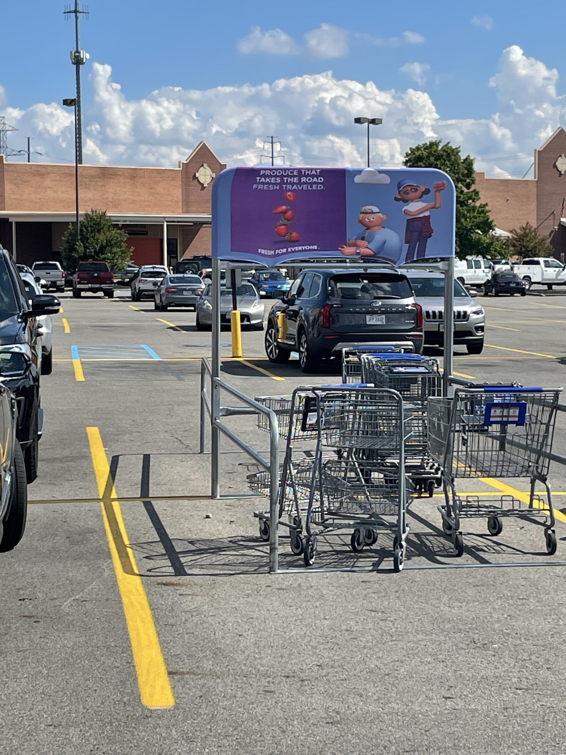
Issues expand beyond the technology friction. It’s clear a user-centered approach wasn’t applied because when we went to put the cart away in the parking lot, there was no signage at the cart corral. These carts seem special, it seemed odd to leave them with others in this hot mess of a cart corral. My wife walked the cart back into the store because she didn’t think it would be good for this “smart cart” to be left outside. Surely that’s not what Kroger intended. A user-centered approach would have led to signage that indicated it was okay to park the smart cart in the corral… or a notification on the cart that said, please return to the store.
(Smart) Cart Corral ?
Human-Centric Approach
My recommendation on these types of projects is to use a design team who has experience in human-centered design. Consider the shopper’s journey and observe how shoppers interact with self-checkout today. Run some tests in a controlled environment and observe shopper unmet needs and pain points. And then design around those learnings.
If you are deploying a technology project and let technology lead, don’t. In my opinion, this was a technology-led project with little consideration of the shopper’s store experience beyond the cart. The shopper-need should lead. The total shopper journey is what you should design for.
Below are considerations for your next experience project:
Put the user at the center of your experience (get in their shoes)
Understand your shopper’s journey. Identify the unmet needs and areas you can improve their experience
Walk the pilot store and observe initial interactions with an experience, ideally by then you’ve worked out major kinks
If you are deploying technology, don’t let it be the lead
Never assume shoppers know what to do
Signage can make a difference. You don’t think people read, but signage is the first thing customers look for if something is confusing
If you don’t set up the test well, don’t discount poor results as indicative of bad technology or a bad idea
Would love to hear your experience with KroGo and whether it was better or worse than ours. Once someone tries it and is familiar with it, it is likely easier. However, setting hurdles like this do not do smart technologies any favors.
Ecommerce finally moves forward
Ecommerce may be finally stepping into a new era. In 1999, a group of colleagues and I built an ecommerce site for a wallpaper retailer. Sadly, not much on the front end design of Ecommerce sites has changed since then; scroll down, find a product, add to cart and keep shopping. Yawn… wake me when it gets fun. Innovation for the most part has been focused on the backend with the obvious goal of selling stuff as quickly and easily as possible.
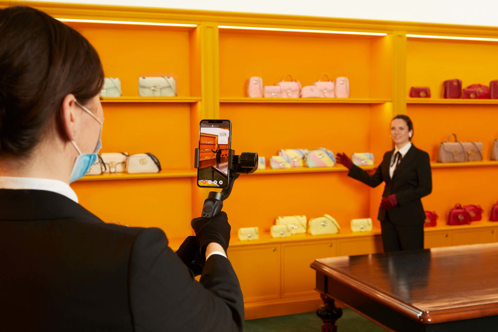
Personalization comes to life…
Gucci Live
However, Gucci’s new personalized video shopping may have just changed all that (No yawn)! Ecommerce efforts in social media (Pinterest, Instagram, Tik Tok) have given new hope and life into bringing the emotion back to ecommerce shopping. However they have still not evolved a real-time human connection until now. Gucci’s Live, a new online service brings the advisor to the customer. The new effort allows Gucci to be more present (human) in the lives of its customers, when and where they want it (technology).
Marco Bizzarri, Gucci president and CEO, said in a statement when Gucci 9 opened. “The service is delivered according to the values that define and differentiate our brand today: a human touch powered by technology.”
Democratizing personalization
In the near-term this level of service is a stretch for most mass retailers as they continue to use human associates. Creative ones like Gucci will integrate influencers, major stars, etc and perhaps even charge a premium for exclusive ‘remote’ shopping experiences. However, we ultimately believe this could easily trickle down to retailers like Target.
Positive COVID impacts
COVID made remote video a reality overnight. The reality of a remote shopping spree with friends in different cities around the world no longer seems like science fiction. This gets us excited about a whole new possibility for Ecommerce!
PINE
At PINE we are always looking ahead for what the future might look like, we call these GLIMPSES. We help Fortune 100 companies translate GLIMPSES into actionable strategies and implementable experiences.
Special thanks to co-author John Youger
“Pack your bags, we’re going to Disney!”…imagine that being echoed through the executive offices of retailers in America.
In the paragraphs below, I’m going to tell you why I think a visit to Disney is what all retail leadership teams should take. My wife and I took our two boys to Disney two weeks ago. My trip was by far the best omnichannel experience I’ve ever had, globally. Writing that feels really odd, almost embarrassing. But I can’t help to know it’s true. Sure there are brands that come close to doing omnichannel relatively well; Delta, Sephora, and sort of Starbucks to name several. [And probably others in China except my Alipay and WeChat won’t work for payment there $%^!].
Back to Disney. We stayed on property and over the course of a week visited Magic Kingdom, Hollywood Studios and Epcot. I hadn’t been to Disney since I was 10. And despite Disney being Expensive and Exhausting, our Disney experience was fun and brilliant in so many ways.
My first peek into the omnichannel world of Disney was when I downloaded the app and connected it to my wristband (I chose yellow of course) profile. For those of you who have not been to Disney recently, their wristband is a comfortable bracelet that is your ticket to the park, and much more. We pulled up to our hotel and went right to our hotel room, bypassing the lobby and check-in desk. We gained entry to our room by placing one of our Disney wristbands up to the door lock pad of our room. At that moment a little part of me shifted from dad on vacation at Disney to consultant Dad, absorbing, evaluating and thinking how my experiences can help our clients.
The two things you need to survive at Disney are your phone with the Disney app and the Disney wristband. Using your wristband you can open your hotel room door, check in for your Fastpass (expedited) ride line and buy anything in the park. Imagine the hassle of grabbing your wallet or Apple Pay on your phone every time you want to buy something, no sweat, Disney solved for it.
Through the app, you can order meals ahead of time, picked up with very little lead time necessary. You can adjust your Fastpasses, accelerating your wait time considerably. And you can self guide around the park.
Tied to your wristband is a sophisticated security system, tracking you throughout the park. We saw this in action when we were going through the Epcot entrance. Our nine year old forgot which finger he scanned and was having trouble with the system syncing up (when you enter the park they match your wristband with your fingerprint). A Disney employee quickly came up, and showed him a photo of himself entering Magic Kingdom scanning his right finger. He scanned his finger and into Epcot we went.
“Digital” hits the physical world in other ways at Disney. Small things like custom designing a car at the Test track or creating an interactive content.
Though I had many takeaways from my Disney experience, below are the big ones:
(1) Disney senior leadership clearly values looking at the Disney experience truly holistically. This view and subsequent experience strategy is undoubtedly then filtered down into tactics that actualize the experience they are trying to create.
(2) If there are corporate silos across physical experience design, digital experience and marketing at Disney parks, they do a great job of not letting the guest see them. There are no seams in this experience, it’s all fluid.
(3) The efforts don’t seem to follow the shiny flash object syndrome embraced by so many retailers. Each and every thing I experienced served a value, whether noticeable to guests or not.
Was it perfect? No, but it was pretty darn close. I didn’t notice anything related to our journey through an “omnichannel” lens (based on technology that is currently in-market today) that could have been better, Disney was really fun. We’ll go back once my kids have jobs and can support their own souvenir addiction.